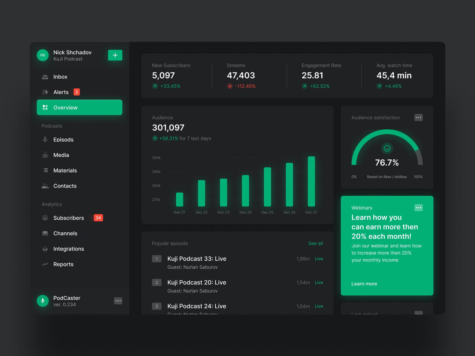
Dark mode has taken the virtual world by storm in recent times. From operating systems and mobile apps to websites, this sleek, eye-friendly design trend has become a favoured choice among users.
Web designers and website owners must understand these trends to capture the attention of users. Every website designers in Melbourne wants to create websites optimised for dark mode, as this is a testament to their skill.
However, you must know what is involved in a project such as this before beginning anything. Here’s a quick guide explaining dark-mode websites in much detail.
Read, remember, and implement!
I. Reasons to Go for the Dark Mode
Dark mode, often referred to as “night mode,” inverts the traditional colour scheme into dark backgrounds with light text and elements. Its popularity has soared for several reasons.
Eye Comfort:
The chief reason why people choose dark mode is because of its reduced eye strain. It’s particularly useful in low-light situations. The dark background reduces screen brightness and is gentle on the eyes. This is a significant benefit for users who spend extended periods on digital devices.
Battery Conservation:
On devices with OLED or AMOLED screens, dark mode can extend the battery life by emitting less light, which requires less power. This efficiency makes it a practical choice for mobile users.
Aesthetic Appeal:
Along with the functionality, dark mode can also add aesthetic appeal to your screen. It displays a sense of elegance and modernity. Users often appreciate this.
II. Vital Factors in Dark Mode Design
Now that you know why dark mode is so popular, let’s understand the critical considerations for designing dark mode websites.
User Choice:
‘Choice’ is important in the digital world. Your users must be able to toggle between light and dark modes. Providing the option to switch allows for a personalised browsing experience, reducing bounce rates.
Colour Scheme:
People often directly think of black when discussing dark mode. However, that’s not the right approach. It is better to choose a dark, but not entirely black, background colour. For example, dark grey or shades of dark blue are common choices.
Also, the text and elements should be in light colours to maintain readability.
High Contrast:
Maintain a high level of contrast between text and background to ensure your content remains easily readable. Following accessibility guidelines is a better idea to guarantee your website is usable by everyone.
Element Consistency:
Consistency is key to an effective dark mode design. Elements, such as buttons, icons, and form fields, should look and function the same in both light and dark modes. This avoids confusion for the users.
Image Adaptation:
Images and media should be optimised for dark mode. So, you must ensure that all your images and graphics display well against dark backgrounds. You can even consider offering alternative versions of images to match the mode.
Dark Mode Icons:
If your website uses icons, consider using dark mode icons that are designed to be more visible on dark backgrounds. These icons often have reversed colours or alternative designs. Your web design company in Perth can offer more specific advice on this matter.
Testing and Feedback:
The last important consideration for dark mode designing is testing. You must thoroughly test your website in dark mode to identify any issues, such as readability problems or design inconsistencies. Taking feedback from users can also be invaluable in fine-tuning the design.
III. Real-World Examples
Many well-known websites have successfully executed dark mode, and users find that very appealing. Here are the best examples you can find.
X (Formerly known as Twitter):
X offers a sleek dark mode that can be switched on in the user settings of the website. It maintains high contrast and readability, making users feel incredibly comfortable while browsing the app or site.
Youtube:
Similar to X, YouTube also provides a dark mode option that is easy on the eyes during extended video-watching sessions. Its background is a dark grey, while the text comes in white and red. This ensures content visibility.
IV. Accessibility in Dark Mode Design
Accessibility remains a critical consideration when designing websites, especially in dark mode. You can ensure your website is accessible to all users, including those with visual impairments, by following these guidelines.
- High Contrast: Maintain high contrast between your background and text. Consider a contrast ratio of at least 4.5:1 to ensure adequate readability.
- Alternative Text: Provide descriptive alt text for images and graphics on your website. It helps screen readers and helps all users understand the content. Many screen reader software programs are available to test this out.
- Focus States: Incorporate clear and distinct focus states for interactive elements like buttons and form fields. With this, users should be able to navigate the site using keyboard controls.
The Best Web Designer in Melbourne for Dark Mode Design:
Designing websites for dark mode has become an essential skill for web designers. It offers a better browsing experience, addresses user preferences, and aligns with modern design trends.
However, finding the best and most experienced professionals takes this whole thing to the next level. If you are waiting for a recommendation, try Make My Website. Their services are the top-rated in Melbourne right now, so it’s worth checking them out.
Besides, the experts at MMW have experience with a diverse range of web designs, from e-commerce to NDIS web designs. You can head to their website for further details.


